Honestly, if you’re struggling with how to make a cursive capital T, you aren't alone. It’s one of the weirdest letters in the English alphabet. Seriously. Most cursive letters at least resemble their printed cousins, but the uppercase T is this floaty, top-heavy structural enigma that looks more like a wave or a boat than a letter.
Modern handwriting is dying. We know this. But then you’re hit with a wedding invitation to address or a formal "Thank You" card that requires more than a sloppy scrawl. Suddenly, that loop-de-loop T becomes the bane of your existence. It’s a rhythmic motion. It’s about muscle memory. If you try to overthink the geometry, you’ll end up with something that looks like a flattened bug.
The Anatomy of the Cursive Capital T
Stop thinking about lines. Think about flow.
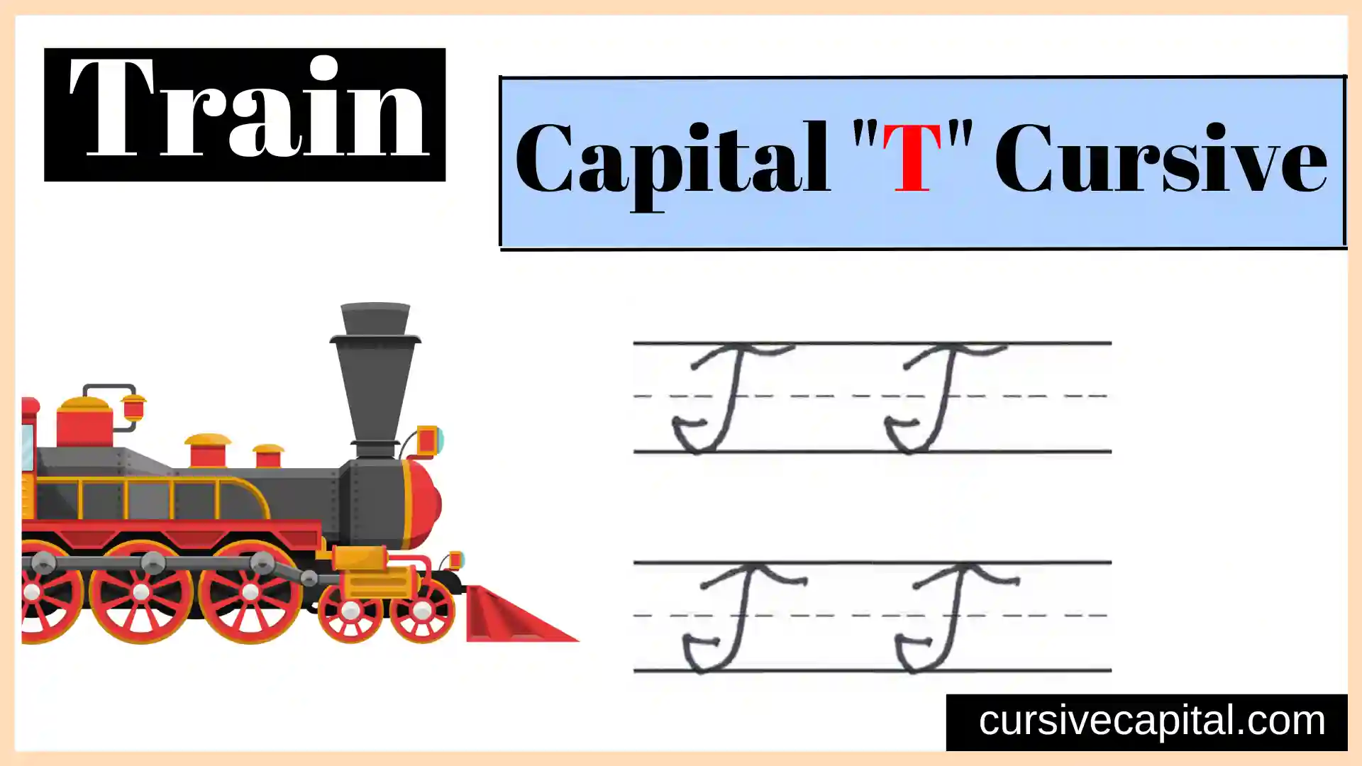
The traditional American cursive style—what most of us know as the Zaner-Bloser or D'Nealian method—treats the capital T as a two-stroke operation. First, you have the "roof" or the "crossbar." It isn't just a flat line. It’s a delicate, wavy stroke that starts with a tiny tick or hook on the left, swoops up slightly, and then settles back down.
Then comes the "stem." You lift your pen. You go back to the center of that wavy roof. You pull a stroke straight down (usually with a slight slant to the right) and then curve it out to the left at the bottom.
It’s disconnected. Unlike the capital F, which looks almost identical but has that little cross-hatch in the middle, the T stands alone. This is where people mess up. They try to connect it to the next letter. Don't do that. A standard cursive capital T is a "non-connector." It sits there, regal and isolated, while the rest of the word starts fresh right next to it.
Why the Palmer Method Changed Everything
Back in the late 19th century, Austin Palmer decided that the fancy, flowery Spencerian script was too slow for business. Spencerian was gorgeous—think the Coca-Cola logo—but it was tedious. Palmer introduced a simplified version that focused on "arm movement" rather than finger movement.
The Palmer T is what most of your grandparents learned. It’s stripped down. No unnecessary loops. Just the wave and the stem. When you're trying to figure out how to make a cursive capital T, looking at Palmer’s 1894 manual, The Palmer Method of Business Writing, is actually helpful because it emphasizes speed.
If you can't write it fast, you aren't doing it right. Cursive was designed for velocity.
Step-by-Step: The No-Nonsense Way to Write It
Let's get practical. Grab a pen. Not a crappy ballpoint that skips—get something that glides, like a G2 or a fountain pen if you're feeling fancy.
- The Boat Top: Start about mid-way between the middle and top lines of your paper. Make a tiny upward tick. Swing it to the right in a gentle "S" curve. This is the roof. It should be wide enough to feel stable but not so long that it shadows the entire word.
- The Plunge: Lift your pen. This is crucial. Now, place the tip just under the middle of that wave.
- The Downstroke: Pull down toward the baseline. Keep a consistent slant. If your handwriting leans 15 degrees, keep this at 15 degrees.
- The Hook: As you hit the bottom line, sweep the pen to the left and up in a small, graceful curve.
Some people like to add a loop at the top of the stem where it meets the crossbar. That’s fine. It’s "flair." But for a clean, legible look, keeping them separate is usually the safer bet for beginners.
Common Mistakes That Make Your T Look Weird
Size matters.
A frequent error is making the top bar too small. If the "roof" is tiny and the "stem" is huge, the letter looks like it’s about to tip over. It lacks balance. Conversely, if the top is massive, it looks like a mushroom.
Another big one: the "F" confusion. If you put a small horizontal line through the middle of the stem, you’ve just written a capital F. I’ve seen people lose points on calligraphy commissions for that one mistake. It sounds silly, but in the heat of writing a long sentence, your brain defaults to adding that extra stroke. Avoid it.
Slant is the third killer. Cursive is all about the angle. If your capital T is perfectly vertical but the rest of your "Thomas" or "Tuesday" is leaning right, the T will look like it’s falling backward.
The "French" Style and Other Variations
If the standard American T feels too stiff, you can look toward the French or European styles. They often use a "single-stroke" T. This version starts at the bottom, goes up, loops, and creates the top bar without the pen ever leaving the paper.
It’s much harder to master. It requires a level of dexterity that most of us lost the moment we started typing 80 words per minute on a mechanical keyboard.
Then there’s the Spencerian T. This is for the "extra" people. It involves varying line thickness—thin on the way up, thick on the way down. You need a flexible nib for this. It’s less about communication and more about art. If you just want to sign a check, stick to the Palmer or D'Nealian style.
Training Your Muscle Memory
You can't learn this by reading. You have to do it.
Take a piece of lined paper. Write the letter fifty times. No, really. Fifty. By the twentieth one, your hand will stop cramping. By the thirtieth, you’ll start to find your "signature" version of the wave.
- Try it with a pencil first. The friction of graphite on paper gives you more control than a slick gel pen.
- Focus on the "swing." It’s a rhythmic motion.
- Check your spacing. Ensure there's a clear gap between your T and the lowercase "h" or "e" that follows it.
The Connection Myth
I mentioned this before, but it bears repeating: how to make a cursive capital T usually involves not connecting. In the vast majority of formal cursive scripts, capital letters like T, F, O, S, L, and P don't join the next letter.
If you force a connection, you usually end up with a weird, awkward tail that ruins the legibility of the second letter. Just lift the pen. It’s okay. The white space is your friend. It provides a visual break that helps the reader's eye identify the start of a new proper noun.
Why Cursive Even Matters in 2026
You might ask why we're even talking about this.
Research from the Journal of Early Childhood Literacy suggests that learning cursive improves fine motor skills and helps with brain development in ways that typing simply doesn't. There's a tactile connection between the hand and the brain.
Plus, there is the "historical literacy" argument. If you can't write a capital T, you probably struggle to read one in a historical document. Imagine trying to read a letter from the 1800s and being baffled by the very first letter of every sentence. It’s like a secret code you’ve been locked out of.
Actionable Next Steps for Better Handwriting
Don't just stop at the T. If you're committed to fixing your script, start with a "warm-up."
Draw "ovals." Just endless, overlapping slanted circles. This loosens the wrist. Then, do a row of "waves"—the same shape used for the top of the T.
Once your wrist is loose, practice the "Capital T to Lowercase Transition." Write "The," "Time," and "Tuesday" over and over. Notice how the pen feels when it lifts after the T and lands for the next letter. This "landing" is where the grace happens.
Finally, check your posture. If you’re hunched over the desk like a gargoyle, your letters will be cramped. Sit up. Angle the paper. Give your elbow room to move. The cursive capital T isn't a finger movement; it’s an arm movement. Use your whole limb to guide the pen, and you'll see the shakiness disappear almost instantly.
Focus on the rhythm of the wave and the stability of the stem. Before long, that weird, floaty letter will be the most stylish part of your signature.
Practical Practice List:
- Use a 55-degree slant guide if you're struggling with consistency.
- Keep the "wave" top approximately 1.5 times the width of the stem's base hook.
- Ensure the stem starts exactly in the center of the wave to maintain balance.
- Practice "air writing" the shape to build shoulder muscle memory before touching paper.