Honestly, most of the charts you see in Monday morning meetings are a total mess. They’re cluttered, the colors hurt your eyes, and usually, the person who made them just clicked a button and hoped for the best. Learning how to make a bar chart excel isn't just about knowing where the "Insert" tab is. It’s about not making your boss squint.
Data visualization experts like Edward Tufte have been screaming about "chartjunk" for decades. If you’ve got gridlines every two pixels and a neon-pink background, you’ve failed before you even started. Excel is a powerful tool, but it's also a trap. It gives you too many options that you probably shouldn't use.
Let's get into the weeds of how this actually works.
Getting Your Data Ready (The Boring Part That Matters)
Before you even touch a chart, look at your cells. If your data is messy, your chart will be a disaster. It's that simple.
You need two columns, basically. One for your labels—like months or names—and one for your numbers. If you have "100 units" written in a cell instead of just "100," Excel is going to get confused. It thinks that’s text. It can’t calculate text. Make sure your numbers are just numbers.
I’ve seen people try to highlight an entire spreadsheet and hit "Bar Chart." Don’t do that. You’ll get a wall of blue bars that mean absolutely nothing. Select only what you need. Click and drag from the top-left label to the bottom-right value.
The Step-by-Step of How to Make a Bar Chart Excel
Once your data is highlighted, head up to the Insert tab on the Ribbon. You’ll see a section called Charts.
There’s a little icon that looks like three vertical bars. Click that. You’ll see options for 2D Column, 3D Column, 2D Bar, and 3D Bar.
Here is a pro tip: avoid 3D charts like the plague. They look like 1998 clip art. Plus, they actually distort the data. The perspective makes it hard to see exactly where the top of the bar hits the axis. Stick to 2D. It’s cleaner. It’s more professional. It’s just better.
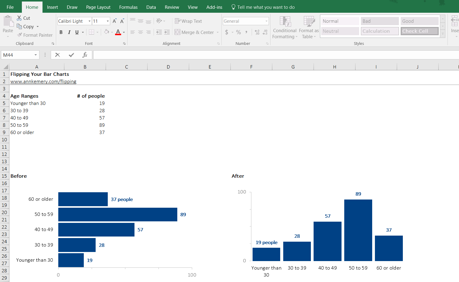
If your labels are long—like "Quarterly Revenue for the Northeast Regional Division"—use a horizontal bar chart. If your labels are short, like "Jan," "Feb," "Mar," go with a vertical column chart. People read from left to right, so horizontal bars are great for comparisons where names are the focus.
Cleaning Up the Visual Noise
Excel puts a bunch of junk on your chart by default. You’ve got to strip it back.
Start with the gridlines. Those faint gray lines in the background? You probably don't need them. Or at least, you don't need them to be that dark. Click one, and hit Delete. Suddenly, your data pops.
Next, the legend. If you only have one data series—say, just "Sales 2025"—you don’t need a legend that says "Series 1." It’s redundant. Delete it. Use a clear chart title instead.
- Click the Chart Title. Don't leave it as "Chart Title." That’s lazy.
- Change the Font. Calibri is fine, but something like Segoe UI or Helvetica feels a bit more "premium."
- Adjust the Gap Width. This is a secret weapon. Right-click any bar and select "Format Data Series." Look for Gap Width. If your bars are skinny and lonely, bring that percentage down to about 50% or 100%. It makes the bars look substantial and confident.
Using Color Without Blinding Anyone
Stop using the default Excel blue. Everyone knows it. It screams "I didn't try."
Pick a brand color or a nice neutral gray for most bars, then use a single highlight color for the bar you want people to notice. If you’re showing that March had the highest sales, make March dark blue and everything else light gray. It’s a psychological trick. You’re telling the viewer’s eye exactly where to go.
Contrast is your friend. If you’re putting labels inside the bars, make sure the text color isn't too close to the bar color. White text on a dark bar or black text on a light bar. Easy.
Adding Data Labels vs. The Y-Axis
This is a big debate in the data world. Do you keep the numbers on the left (the Y-axis), or do you put the numbers on top of the bars?
If you put data labels on the bars, you can usually delete the Y-axis entirely. This makes the chart look "open" and modern.
- Right-click a bar.
- Select "Add Data Labels."
- Click the Y-axis (the numbers on the left).
- Hit Delete.
Now your chart is just the data. No jumping back and forth between the bar and the axis to figure out if it’s a 74 or a 76. The number is right there.
Common Mistakes That Ruin Your Credibility
The biggest mistake is the "truncated axis." This is when you start your Y-axis at something other than zero. If your sales go from 90 to 100, and your axis starts at 80, the 100-bar looks twice as big as the 90-bar. That’s lying with statistics.
Always start at zero unless you have a very specific, technical reason not to.
Another one? Sorting. Don’t just leave your bars in random order. Sort your data in the cells from largest to smallest before you make the chart. A "descending" bar chart is much easier to read because it creates a natural "staircase" effect. It’s instantly clear who is winning and who is losing.
Dealing with Dates
Excel tries to be smart with dates, but sometimes it's annoying. If you have gaps in your dates, Excel might leave big empty spaces in your chart to represent "missing" days.
If you want the bars to be right next to each other regardless of the date spacing, right-click the horizontal axis and select "Format Axis." Under "Axis Type," change it from "Automatically select based on data" to "Text axis."
This treats your dates like labels instead of a timeline. It’s a lifesaver when you're doing weekly reports but skipped a week for a holiday.
Exporting for Presentations
Don’t just screenshot your Excel sheet. It looks grainy.
Instead, click the edge of your chart and hit Ctrl+C. Go to PowerPoint or Word and hit Ctrl+V. But wait—check the "Paste Options." You can either embed the workbook (which makes the file huge) or link the data.
Linking is cool because if you change the numbers in Excel later, the chart in your PowerPoint will update automatically. Just don't move the Excel file to a different folder, or the link will break and you'll be sad.
Real-World Insight: The "Squint Test"
There’s a concept in design called the "Squint Test." Look at your bar chart and squint your eyes until everything gets blurry.
What stands out?
If you can still see the general trend and the most important data point while squinting, you’ve done a good job. If everything just looks like a gray blob, you need more contrast or a better title.
Actionable Next Steps
To really master how to make a bar chart excel look elite, start with these three moves right now:
- Kill the clutter: Delete the gridlines and the legend immediately on your next project.
- Sort the source: Go to your data table, highlight it, and use the "Sort Large to Small" function before creating the visual.
- Direct Labeling: Add data labels to the top of your bars and remove the vertical axis to give your chart a modern, breathable feel.
Once you get comfortable with these, you can start looking into "Combo Charts"—like putting a line graph over your bars to show a target—but for 90% of your work, a clean, well-spaced 2D bar chart is all you'll ever need.