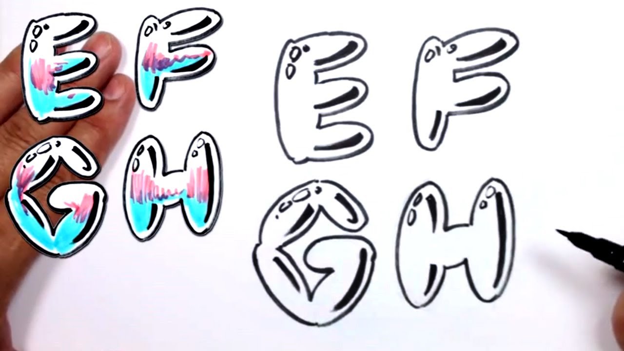
You see it on every subway car in 1970s New York photography and every "cool" notebook cover in middle school. It’s bubbly. It’s round. Most people call it "Softie" style, but it’s basically the backbone of street art history. If you've ever tried to draw a graffiti bubble letters alphabet, you probably realized pretty quickly that it’s not just about making letters fat. It’s actually about gravity and how shapes overlap.
Honestly, most online tutorials make it look like a font. It isn't a font. It’s a physical interaction of shapes.
Where the Bubble Actually Came From
Phase 2. That’s the name you need to know. Lonny Wood, known in the writing community as Phase 2, is widely credited with pioneering the "softie" or bubble letter style in the early 1970s. He was part of the United Graffiti Artists and basically changed the game because, before him, everything was "Top-to-Bottom" or "Broadway Elegant"—skinny, tall, and hard to read from a distance. Phase 2 realized that if you inflated the letters, they took up more surface area. More surface area meant more color. More color meant you couldn't miss it.
It was a survival tactic for the eyes.
The Bronx was the laboratory. Writers like Blade and Tracy 168 took what Phase 2 started and pushed the boundaries of how much "air" a letter could hold before it became unrecognizable. This wasn't just art; it was branding. If you were a writer in 1974, you needed a "throw-up" (a quick, two-color piece) that you could finish in under two minutes before the transit cops showed up. The graffiti bubble letters alphabet was the perfect solution because circles are faster to draw than squares. Your hand moves in a natural arc. It’s ergonomic.
The Physics of a Good Throw-Up
Stop thinking about letters as lines. Think of them as balloons squeezed into a box.
When you draw a "B" in a bubble style, the middle bar isn't a line anymore. It’s a pinch point. The top loop and the bottom loop are fighting for space. This is what the pros call "letter structure." If your letters look "off," it’s usually because you haven't decided which part of the letter is "in front."
In a classic graffiti bubble letters alphabet, the letters usually lean. A slight tilt to the right gives the whole alphabet a sense of forward momentum. If they’re perfectly vertical, they look static and boring, like a clip-art font from a 1998 Microsoft Word document. You don't want that. You want flow.
Let’s talk about the "O" and the "S"
The "O" is the easiest, right? Wrong. An "O" in bubble style needs a "donut hole" that is positioned off-center to create a sense of weight. If the hole is dead center, it looks like a tire. If it’s slightly high and to the left, it looks like it’s vibrating.
The "S" is the real nightmare. It’s the letter that separates the toys (beginners) from the kings. A bubble "S" is essentially two fat sausages stacked on each other. If you don't get the overlap right, it looks like a broken spring. Most experienced writers will tell you to draw the "S" as three overlapping circles first, then trace the outline. It’s a cheat code, but it works.
Why Your Markers Keep Bleeding
People buy cheap paper and wonder why their work looks like a blurry mess. If you're practicing your graffiti bubble letters alphabet, you need coated paper. Why? Because the ink needs to sit on top of the page so you can blend. If the paper absorbs it instantly, you can't get those smooth gradients that make the letters look 3D.
- The Outline: Always use a chisel tip or a fat mop marker.
- The Fill: This is where you go wild. Traditionally, "throwies" use white or chrome fills with a dark outline. It’s high contrast. It pops.
- The Highlight: This is the secret sauce. A tiny white "glint" on the top-left curve of every letter. It makes the letter look like it’s made of plastic or glass. It’s a simple trick that adds 50% more value to the piece.
Common Mistakes That Scream "Amateur"
I see this all the time on Instagram. Someone draws a beautiful alphabet, but all the letters are different sizes. In a real graffiti piece, the "cap height" (the top of the letters) and the "baseline" (the bottom) should be relatively consistent, even if the letters are bouncing.
Another big one: Negative space.
In bubble letters, negative space is the enemy. You want as little "empty" air between the letters as possible. They should be "biting" or overlapping. If I can see the wall behind your "A" and your "B," you haven't pushed them close enough together. They should look like they're huddled together for warmth.
The "Dead" Spots
Look at the letter "A." The little triangle in the middle? That's a dead spot. In a heavy bubble style, you often eliminate that hole entirely or turn it into a tiny slit. The goal is to maximize the "fatness." If a letter has too many holes, it loses its "buoyancy."
The Evolution: From 1970s NY to Modern Digital Art
It’s funny how things come full circle. What started as a way to avoid getting caught by the NYPD is now a staple of graphic design. You see bubble letters on cereal boxes, high-end streetwear like Supreme or Stüssy, and even in digital UX design.
But there’s a nuance lost in the digital version. When you draw it by hand, your "muscle memory" creates imperfections that the computer can't replicate. The way a spray can loses pressure or the way a marker drags on the paper—those "mistakes" are what make the graffiti bubble letters alphabet feel alive.
Some purists, like the ones you'll find documented in Henry Chalfant’s Subway Art, argue that if it isn't on a wall, it isn't graffiti. While that's a bit extreme, there's a point there. The scale matters. Drawing a bubble letter 2 inches tall is a completely different physical experience than drawing one 4 feet tall using your entire arm as a compass.
Getting Started: A Practical Workflow
If you’re serious about mastering this, don't start with a spray can. You’ll just waste money and get frustrated. Start with a "blackbook" (a sketchbook with thick paper).
First, write the alphabet in simple, thin block letters. Don't worry about style yet. Just get the spacing right. Then, take a different colored pencil and draw a "cloud" around each letter. Imagine you're putting a puffer jacket on the alphabet.
Where the jackets bump into each other? That's your overlap.
Once you have that, take a heavy black marker and do the outline. Don't flip-flop. Commit to the line. One smooth motion is better than ten shaky ones. If you mess up, incorporate it. Graffiti is built on "freestyling" your mistakes into features.
Recommended Tools for 2026
- Markers: Posca (water-based) for control, or Molotow (alcohol-based) for that permanent, street-ready look.
- Paper: Bleed-proof marker pads (at least 70lb weight).
- Reference: Look up "Style Wars" or "Infamy" documentaries to see how the hand moves.
Beyond the Basics: Add-ons and Bits
Once you've nailed the basic graffiti bubble letters alphabet, you start adding "bits." These are the little arrows, bubbles, or "cracks" that float around the letters. They aren't just random. They're used to balance the composition. If the left side of your "M" looks too heavy, you put a floating bubble on the right side of the "Z" to even out the visual weight.
Drips are another classic. But don't overdo it. A drip should look like it's falling because of gravity. It should follow the curve of the letter. If you put a drip on the top of a letter, it looks weird. Drips belong at the bottom.
The Actionable Path to Mastery
To actually get good at this, you need to stop copying other people’s alphabets and start building your own "skeleton."
- Phase 1: Fill five pages with just "O"s. Vary the fatness. Find the point where the "O" becomes a square and the point where it becomes a circle.
- Phase 2: Practice "connections." Pick two letters—like "R" and "E"—and draw them 50 times, each time changing which letter is in front.
- Phase 3: Limit your palette. Use one dark color for the outline and one light color for the fill. Complexity hides bad technique; simplicity exposes it.
- Phase 4: Speed up. Set a timer for 30 seconds and try to write your name in bubble style. Speed forces your brain to prioritize the most important shapes.
The graffiti bubble letters alphabet is more than just a nostalgic 70s relic. It’s a masterclass in shape theory and spatial awareness. Whether you’re looking to get into street art or just want to level up your doodling, focusing on the weight and "pressure" of the letters is what will make your work look authentic rather than like a cheap imitation. Stick to the skeletons, avoid the "clip-art" look, and remember that in the world of bubbles, fatter is almost always better.