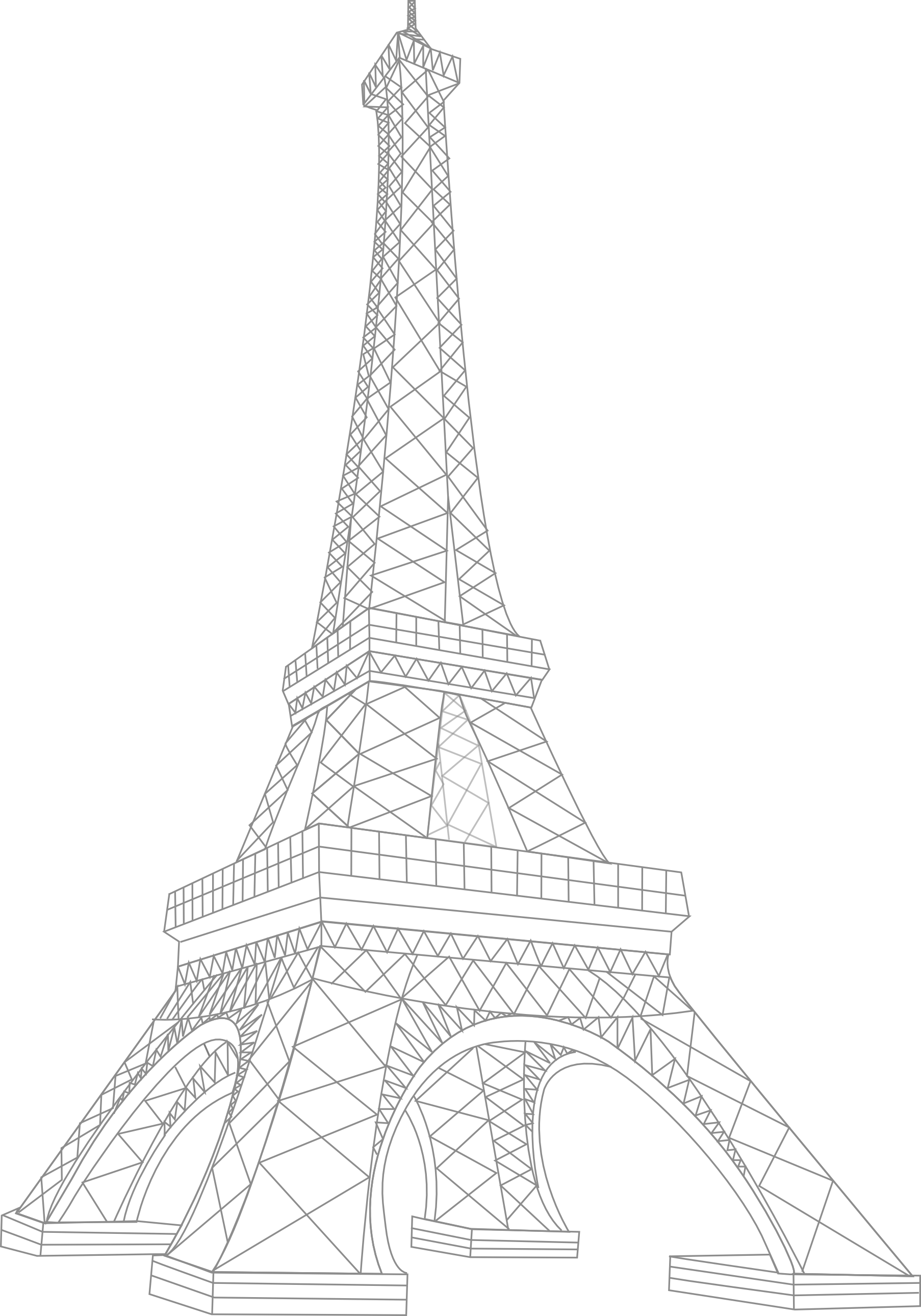
You’ve probably been there. You have a blank sheet of paper, a pen that’s maybe a little too inky, and a sudden urge to sketch something iconic. Naturally, your mind goes to Paris. You want to create an Eiffel Tower simple drawing that actually looks like the Iron Lady and not a lopsided oil derrick. But then you start looking at photos. You see the intricate iron lattice, the thousands of rivets, and the sweeping curves that seem to defy basic geometry. It’s intimidating. Most people give up before the first line is even dry.
Honestly, the biggest mistake is trying to be an architect. Gustave Eiffel already did the heavy lifting back in 1889; you’re just trying to capture the vibe.
Drawing the Eiffel Tower shouldn't feel like a math exam. It’s basically just a very tall, very elegant capital letter "A" with some extra flair. If you can draw a triangle and a few curved lines, you’ve already won half the battle. The secret isn't in the details—it’s in the silhouette. If you get the proportions right, your brain fills in the rest of the metalwork automatically.
The Geometry of a Masterpiece
Before you even touch the paper, let’s talk about what makes the tower look like the tower. It’s not a straight pyramid. If it were, it would look boring. The Eiffel Tower has a specific "flare" at the bottom that was designed to resist wind pressure. This is a real engineering fact: the curve of the base follows a mathematical pattern to ensure the structure stays upright during Parisian storms. For your Eiffel Tower simple drawing, this means your side lines need to curve inward as they go up.
Think of it like a long-waisted dress.
The tower is divided into three distinct sections. You have the wide base, the middle observation deck, and the narrow top where the antenna sits. If you divide your vertical space into thirds, you're going to end up with something that looks squat and weird. The top section is actually much longer than the bottom two. It’s about height and grace.
Starting Your Eiffel Tower Simple Drawing
Don't start with the feet. Start with a center line. A light, shaky pencil line right down the middle of your page acts as your spine. Without this, your tower will lean. Unless you’re trying to draw the Leaning Tower of Pisa in a French hat, keep it straight.
Once you have your spine, draw a very narrow triangle at the top. This is the "hat" of the tower. Below that, draw two lines that curve outward. They shouldn't be sharp angles. They should feel organic, like the way a stream of water spreads out when it hits a flat surface.
Now, the "A" bar.
There are two main platforms. The first one is about a third of the way up from the bottom. The second is about halfway. These are just horizontal rectangles. If you’re going for a truly Eiffel Tower simple drawing, just make them slightly thicker lines. You don't need to draw the tiny people eating expensive macarons on the second floor.
Dealing with the Lattice (Without Going Crazy)
This is where most people mess up. They try to draw every single cross-beam. Please, for the love of your own sanity, don't do that.
The ironwork is a pattern of "X" shapes. In a simplified sketch, you only need a few. Focus on the main structural legs. Draw a few "X" marks inside the legs and maybe a bit of "scribble" texture in the platforms. This gives the impression of complexity without you having to spend six hours with a magnifying glass.
Professional illustrators, like those featured in Architectural Digest or urban sketching blogs, often use a technique called "suggestive line work." Basically, you draw 20% of the detail and let the viewer’s eye do the other 80% of the work. If you draw the outline perfectly, a few diagonal slashes are all you need to scream "Parisian ironwork."
Common Pitfalls and How to Avoid Them
- The "Squat" Tower: This happens when the base is too wide. The Eiffel Tower is surprisingly slender. If your drawing looks like a heavy bell, narrow the base.
- The Straight Leg: If your side lines are perfectly straight, it loses the "spring" that makes the tower iconic. Always give it a slight inward curve.
- Over-detailing the top: The top is mostly just a point with a little nub for the antenna. Keep it clean.
Why Simple is Actually Better
There’s a reason why the "minimalist" aesthetic is so popular on sites like Pinterest and Instagram. A Eiffel Tower simple drawing captures the romantic essence of the landmark better than a cluttered, messy attempt at realism. It’s about the symbol. The tower represents innovation, romance, and the city of light. You can convey all of that with ten well-placed lines.
If you’re using ink, vary your line weight. Make the base lines slightly thicker than the top lines. This creates a sense of "grounding" and depth. It makes the tower look like it’s actually standing on the Champ de Mars rather than floating in a white void.
Adding the Finishing Touches
A drawing is never just the object itself; it’s the environment. Since this is a simple sketch, you don't need to draw the entire city of Paris.
Maybe add a couple of "m" shaped birds in the sky. Maybe a tiny little cloud off to the side. If you really want to get fancy, draw a couple of curved lines at the very bottom to represent the trees in the park. But keep them vague. The focus should stay on the tower.
If you’re working digitally, like on a Procreate or iPad setup, try using a textured brush that looks like charcoal or a fountain pen. The slight imperfections in a "simple" drawing are what make it feel human. Perfection is for blueprints. Art is for feeling.
Actionable Steps to Perfect Your Sketch
To move from a "okay" sketch to something you’d actually want to put on a greeting card or in a bullet journal, follow these specific steps:
- The 1-Minute Warm-up: Grab a scrap piece of paper and try to draw the tower in exactly 60 seconds. This forces you to ignore the rivets and focus purely on the shape. Do this three times. You'll notice your third one is much more confident than the first.
- The "A" Method: Start with a tall, thin "A." Curve the legs outward. Add a horizontal line for the first floor and a shorter one for the second. This is the skeleton of your Eiffel Tower simple drawing.
- The Cross-Hatch Shortcut: Instead of drawing individual beams, use light cross-hatching (diagonal lines crossing each other) only at the joints of the tower. It creates a shadow effect that mimics the look of dense iron.
- Check Your Negative Space: Look at the shape of the "air" inside the tower's legs. It should look like a tall, thin archway (specifically a parabolic arch). If that space looks like a squat doorway, your legs are too far apart.
- The Pen Test: If you're nervous about ruining your sketch, do the outline in pencil first, then go over it with a fine-liner. Once the ink is dry—and I mean completely dry—erase the pencil marks. It instantly looks 10x more professional.
Drawing doesn't have to be a high-stakes endeavor. It’s just lines on a page. The Eiffel Tower is one of the most recognized structures in the world, which is a double-edged sword: people know what it looks like, but that also means they’ll recognize it even if your drawing is incredibly basic. Trust the shape. Trust the curve. Stop worrying about the rivets.
Next Steps for Your Art Practice
Go grab a 0.5mm black ink pen and a small notepad. Find a photo of the tower from a "worm’s eye view" (looking up from the bottom) and try to apply the curve technique. Focus specifically on how the four legs meet at the first platform. Mastering that intersection is the key to making any simple sketch look grounded and three-dimensional. Once you've nailed the silhouette, try experimenting with different "line weights"—using thicker lines for the base and whisper-thin lines for the top to create a sense of atmospheric perspective.